The two main graphs are the Everyday Weather and Temperature graphs.
Everyday Graph
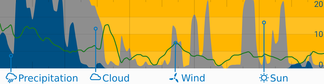
This graph is a great way to see the weeks’ weather at a glance. It shows:
- Precipitation (water is blue):
- Range: 0 - 4 mm/hr or 0 - 0.15 in/hr
- Total cloud (clouds are grey):
- Range: 0 - 100 %
- Wind speed in green.
- Range: 0 - 20 kt (right scale)
- Sunny weather is indicated by the yellow background
Temperature
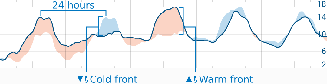
The blue and red areas show the change in temperature from the same time the day before. This is a great way to see when it gets warmer or colder (or warm and cold fronts) at a glance.
Range: auto Units: °C or °F
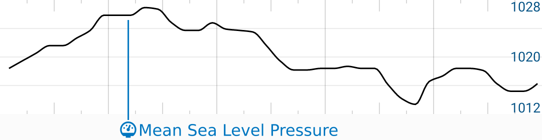
Mean Sea-Level Pressure Graph (Units: hPa. Range: auto)
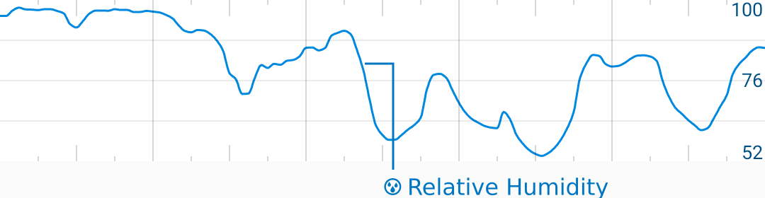
Relative Humidity Graph (Units: %, Range: auto)
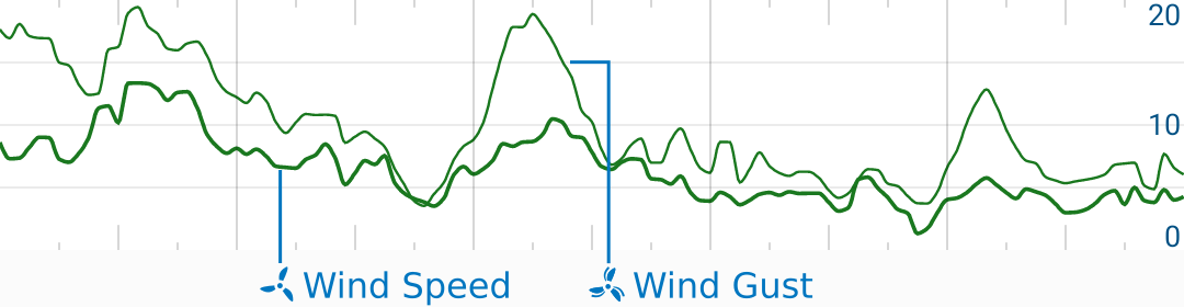
Wind Speed and Gust Graph (Range: 0-20 kt)
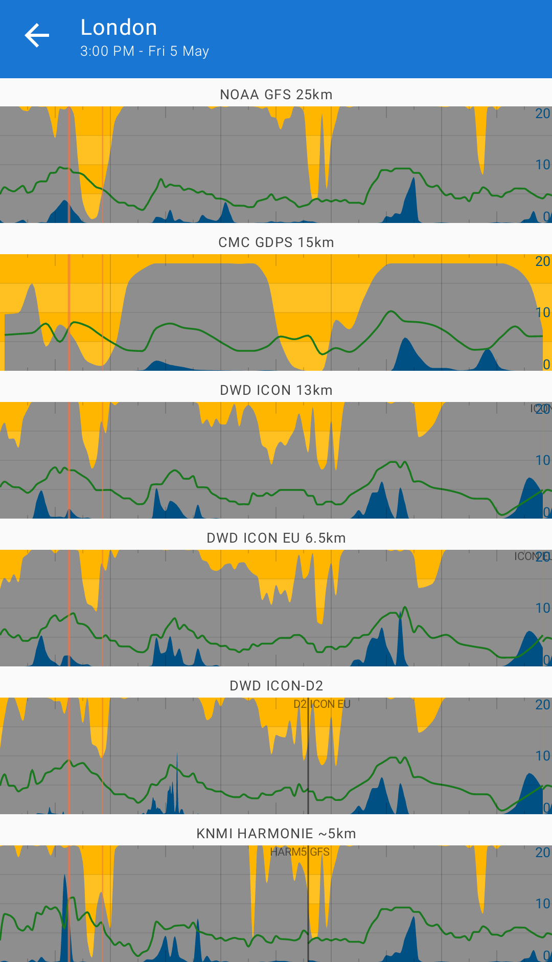
Compare Mode
Compare model is a useful tool for comparing predictions across many data sources.
If you double-tap on any graph, Flowx will show you a stack of graphs - one for each data source.
While in compare mode, you can double-tap on any graph to return to the main screen and show the selected source.
Future Work
- Add ability to change/add/remove/move graphs.
- Add ability to set graph ranges.
- Add editor for graph customization.